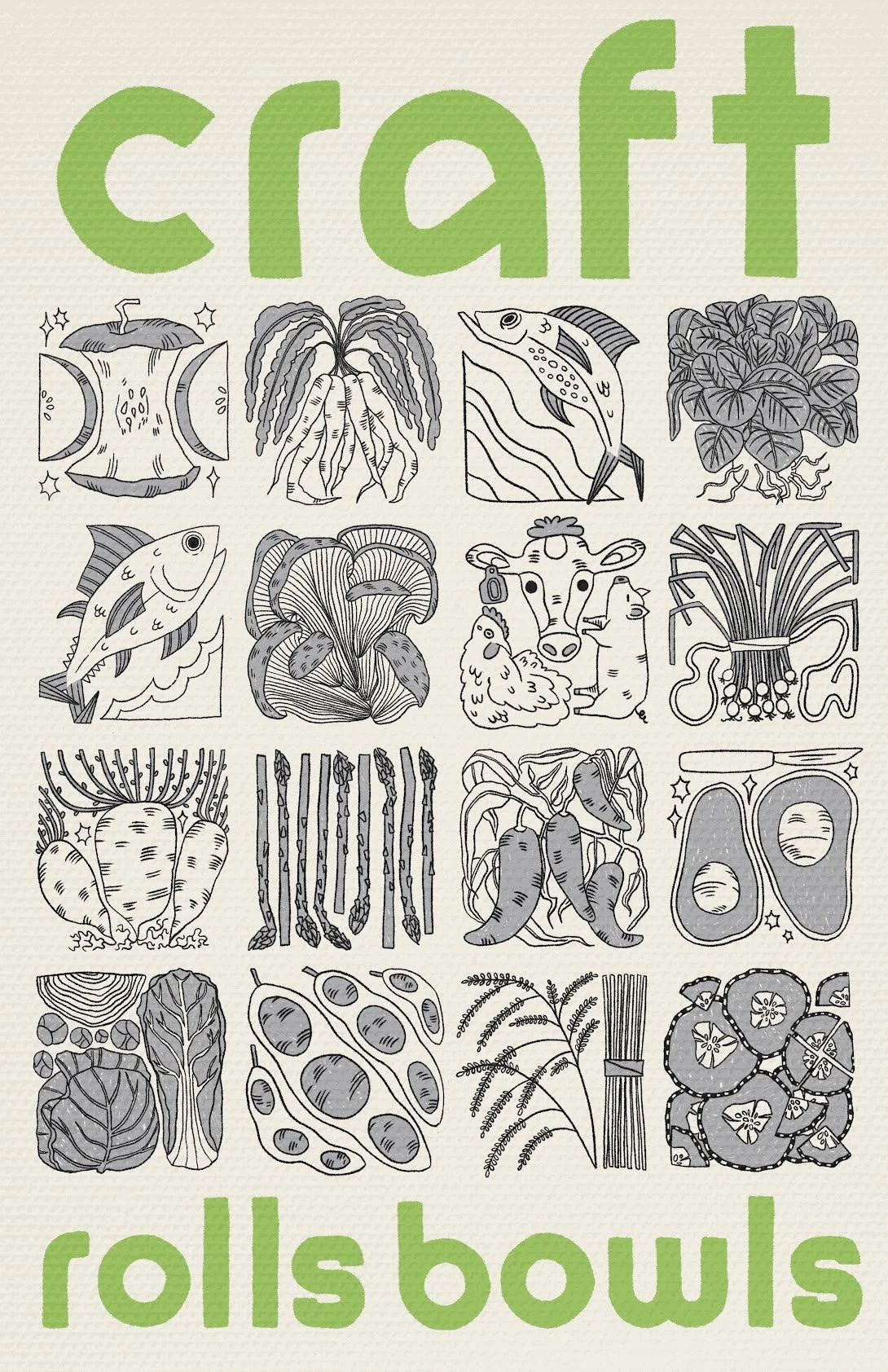
Craft Sushi
Rolls & Bowls
Follow the process of making a poster for a local restaurant! The objectives are: create an eye-catching visual using the predetermined Craft Sushi color palette, remind the viewer of the farm to table freshness of the products served, and create a clean looking visual to match the modern interior design of the store.
1.Thumbnails & Sketches
My designs begin as simple thumbnail sketches. These are quick, small drawings that help me get my ideas down before they slip away. They allow me to see the big picture and experiment with different colors and compositions. It’s a relaxed way to work, and I can easily change things if I need to.
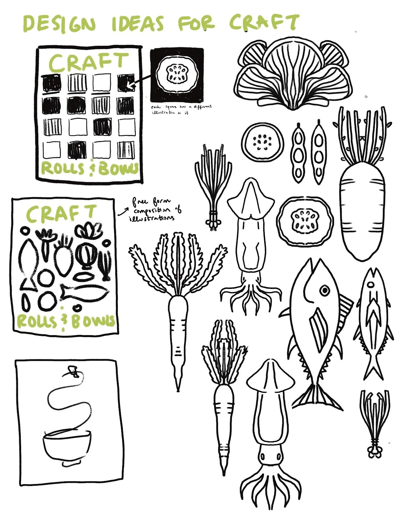
2. Following Strong Ideas
After I’ve created a few rough sketches for the project, I’ll pick my favorites and refine them further. These sketches aren’t quite finished yet, but they give me and the client a better idea of what the final product will look like. This helps us both understand what we like and don’t like about the compositions. It also lets the client choose which one they’d like to develop more. .
3. Decide on Final Direction
When a client chooses a composition, I can make my sketches more polished and final. I love adding texture to digital designs like this one to make them feel more grounded and real. You could say it’s one of my signatures.
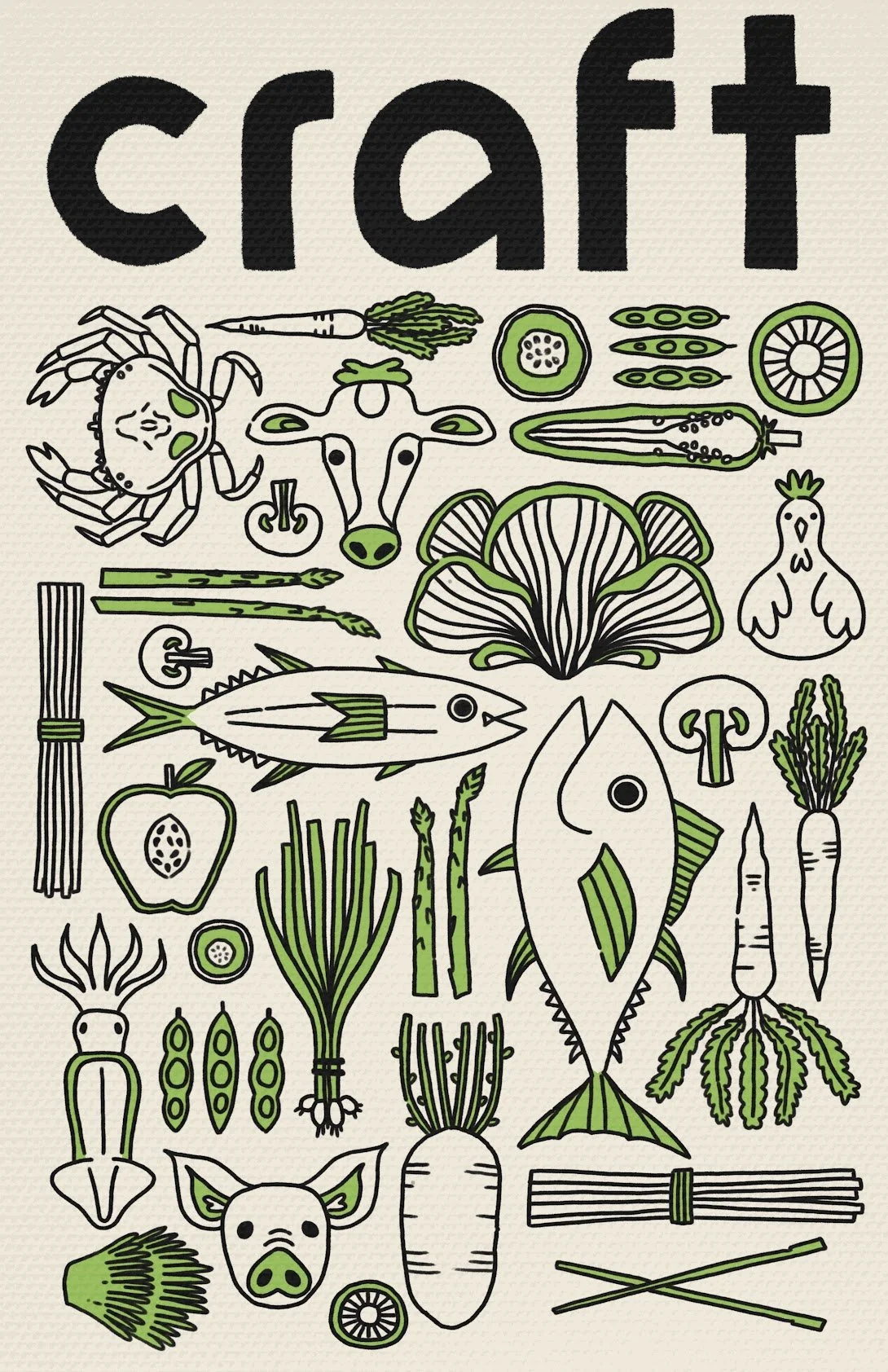
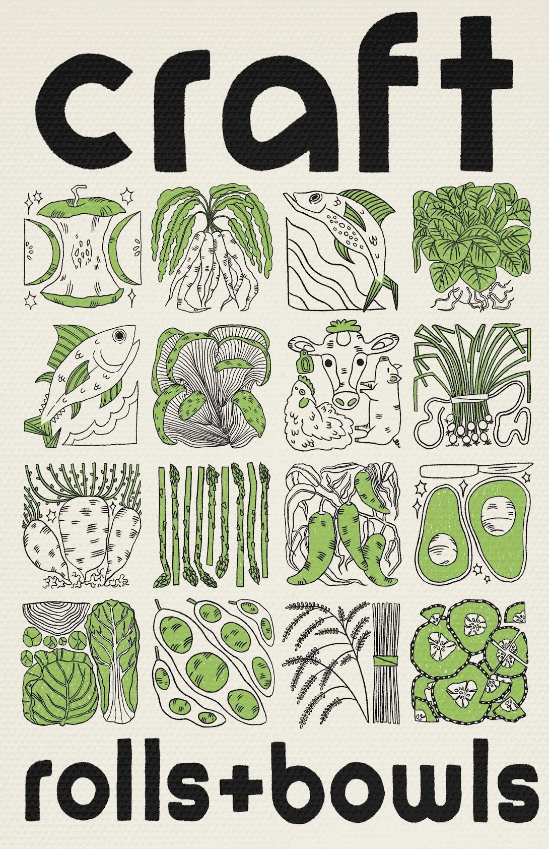
4. Color Variation
When working on projects, I often experiment with different color options to ensure I’ve chosen the most eye-catching and visually appealing one. Sometimes, clients request changes to see how a different color palette would look. Ultimately, it’s their choice, but I always make sure they understand the reasons behind certain color choices. In this case, the “Craft Sushi” green doesn’t stand out enough against the background color, making the overall design feel less impactful than the final design shown above.